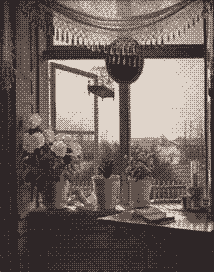
The artist in this case being Martinus Rørbye. The view from my window is endless fire and eternal agony.
So I guess being an art gallery and all, I have to justify the existence of this place as more than just a dump for my softcore furry porn, meaning you get pieces like this popping up from time to time. Oh, sure, first it's an innocent test of algorithms… You start making copies of pictures at different resolutions, colours, compression algorithms, and so on, but once you've been doing it long enough (FOUR DAYS), then you start to develop a taste for it. Well, enough is enough! Time to come out of the closet. Ladies and gentlemen, I am sexually attracted to windows. It's a convenient fetish, given how only they can hold this [editors note: redacted for my grandma's sake].
Seeing the original image on the front page of Wikipedia was, initially, a bit of a shock. Not because it was shocking, but because the painting was so expertly crafted that I temporarily couldn't believe it existed. There's an urban legend saying that some people will faint whenever they see a thing of great beauty, as a response to the brain not physically being able to process it. Whenever that happens to me, I imagine myself fucking that thing as a sign of dominance over it, making trips to the museum a bit awkward.
But the colours of the original were applied so expertly that it would be easy to mistake for a photograph, if not for the idealised shading, the obvious wear of the paint, and highlights that could only come from a precision painter. That's all technique, though; the main reason I like it is because of how mundane the subject matter is, and yet how beautifully it's presented. Being able to take something as banal as a window scene and, with but composition and colour, turn it into something that's thrilling to look at, is a sign of a great imagination.
More impressive is how this portrait was made in 1825, back when you had to do all of this by hand. Now some asshole (cough) can just take it and apply a shitty 1–bit colour reducer to demonstrate the sophistication of current technology and how it's possible to take a detailed piece of art and fit it into a limit that a lot of people would consider unworkable. But I made it work. Its efforts to retain the realism of the original is admirable given how it's literally four colours.
So rejoice, kids! It's a win–win all around. I get to legitimise my art gallery, show off the possibilities, and make up for my own degenerate lack of skills by posting somebody else's. I kid of course; it was actually incredibly tedious finding the perfect balance between quality and filesize, which you would never realise just looking at the image above. "Oh, he just cropped an image and applied a filter". Well, yes, but it took me an hour to choose the perfect crop and the perfect filter. In the arts, even work that should be easy, isn't.
Date: 2017–02–04. Size: 6,981 bytes. Colours: Four.
Upscaled Dimensions: 642×816. Original Dimensions: 214×272.