Heads up: the artist is a sick fuck who's not afraid to draw lewds. I can't protect you past the source page — you'll venture forth and find such unsavoury things as tits on a dog. On a dog. AND YORDLES. And yes, I realise I just did a Temmie image. No, I'm not in love with Temmie — all the images deserve their place, even if Temmie was one of the only salvageable takeaways from the trainwreck that was Undertale.
So. Plague of Gripes. What is there to say about Plague of Gripes? Well, nothing much, really; his art is the typical furry trash you'd find on… well, /trash/, incidentally. It plays to the typical paternal instincts of cuteness and romance, featuring those big old eyes, girls in compromising positions, with just enough dignity to take characters that by all rights should be sex symbols, and turn down the sex enough so that people don't feel guilty for looking at them. Hence the artist's stupid levels of popularity on Tumblr.
If you're going to ask me why so many people find this particular style of art so appealing, I could only throw guesses into the air and then blast them with my gun. Is it because the artist isn't blatantly furry, focusing on work that even normies can get behind? Maybe it's because they focus on childhood waifus, cashing in on that sweet nostalgia. Perhaps they're a gateway artist, an artist that appeals to so many people, and so you don't have to have your opinion challenged for enjoying them.
Are they a good artist? Well, "good" and "meaningful" aren't the same thing. I define an artist as anybody who makes a sincere effort to change culture for the better. This art isn't challenging or innovative in any meaningful sense. Though it's different from the typical FurAffinity popufur fare, you still couldn't go a day of trolling around without seeing somebody who draws just like them. They try to make cute girls with some novelty to them, and they succeed. They're competent. But that's all they are.
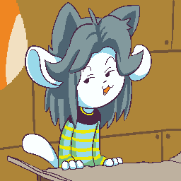
BUT, there are always exceptions, a "reverse stopped clock" where even an unremarkable artist can create something fascinating once in a while. Some of an artist's best work comes from a place you would never expect them to go. "Aliasing?" they scoff. "Yeah, let's try out that meme…" And lo and behold, they come up with the image above, something entirely unlike anything they have ever made before (to my knowledge, as I'm not a pog enthusiast).
You have to understand I've been in the arts for a long time. Usually when a newbie sees something that interests them, it's not because it appeals to their higher emotion. It's because it instead appeals to the primitive parts of their brain that gives them dopamine and tells them "Yes, I want all of this, in my face, right now!". You can literally feel, as a young art consumer, a high in your head while viewing something that appeals to you. And that's fine up to a point — we all have to get an interest somehow. But relying on that high to develop your tastes isn't a good plan, because the high is certain to fade, and all you'll have left is your well–defined palette to guide you.
I don't feel any particular high for this image, but I still feel a lot of appreciation for the way its made. The original captured the wry character of Tem, with it's solicitation of cash, its playful colours inviting a child–like otherworldliness to a mundane scene, and crudely–drawn outlines, still disciplined in their placement, allowing the work to flow in its own universe without the expectation of satisfying anyone else. It's damn good work, and something so simple that it can inspire anybody who wants to take a look at it.
It brings me some shame to say the hacking of this piece was… not my best work. The picture was drawn as such where it begged for a higher resolution, but we have a data limit to keep, so I had to squash it in with an ugly downscale. Then I edited out some non–essential elements, and found the framing of the piece to be awkwardly off–center. Anybody who gives any thought into digital art knows that it's impossible to create something from nothing, so I had to draw in the left side of the piece once I shifted the rest over to the center. I believe I captured the original's scribbling well enough.
While I could have left it at that, a professional knows there is always room to improve. I remember a parody image featuring Sesame Street characters saying something like "everybody's wrong except for me", and I want to create a variant saying "everybody's art style sucks except mine". You know me, being a silly old minimalist and all, seeing opportunities to simplify the construction any way I can. One of my rules of thumb is to never draw a line when a shade will do. My second one is "comprehension comes before detail". But I only have two thumbs, so I can't blather on.
I suppose these tenets are a justification for my inability to clean up the lines without spending a hell of a lot more time on it than I want to, though that's only in comparison to the really extraordinary original. Those lines don't feature any aliasing, though you wouldn't guess without zooming in. Unobtrusive aliasing is actually a common trend, which is really convenient for image optimising, though it's only being utilised by a really prolific artists, making artists incorrectly think they would be cramping their style if they were to adopt this trend.
But this is the point where I am blathering on, so I'll leave this image with the understanding that, given a comparison of two different works, one derived from another, the differences are not as obvious as you would assume them to be, and it takes a soft yet firm hand to alter an image without destroying the sensibilities of the original.
And of course, keen viewers will notice this image as the source of the Degenerates logo. That was a bit of a miracle, that. I was creating a 20000×20000 image as a test, I zoomed in to a random section to check the results, and the eye was the only thing visible in the screen. And when I saw this image, this idea of something simultaneously self–aware, depressed, and amused, a dozen different contradictory emotions all in one inscrutable, dead–simple image, it was a eureka moment. I knew I had to use it.
But I already had an image for the 10kB gallery, which represented its interests well: a cross with squares closing in on a point in a representation of video games (which traditionally featured extraordinarily small art assets), the compression of data (the cross appearing to get smaller as its points converge), the exacting nature of the gallery (as the cross is a very simple, perfectly symmetrical shape), and the idea that the work is "right on target", as the cross can be interpreted as a crosshair.
Where would I put this image? What would I use it for? Well, I already had this idea of a Froghand collective, where I could post all of my writings under a new media empire as opposed to one obscure website. Of course, it didn't represent me. It was too white, and too purple. But at the same time, it kinda did. No other logo has ever made me feel something like this logo has, and growing up in North America, you see a shit–ton of logos. I had to use it.
The line of reasoning from there was pretty simple. Froghand was dead, and given this project, I was stuck with enough writing for one additional lifetime, or at least when I view all the art worth talking about. So I didn't expect to revive Froghand any time soon. But I did have a new project, one that's really easy to spread to other artists and contribute to. If all it took was a new face and a change of direction to make my dreams come true, then so be it. I always used "degenerate" as my favourite not–quite–crass word, so I might as well appropriate it for an always–snappy, yet dead serious art collective. Thus was born the Degenerates; a total fluke, yet with so much going for it.
So that's where I got the idea for The Degenerates. That's the story I want to most tell, at least, because out of the many possible ideas for where this idea of an arts collective came from, like an instance of Deja Vu, a dream somewhere way back, or just a pent–up desire to make something of the world generated over years, the simple fact is that the logo came out of dumb luck. No divine intervention — just luck.
Happy end of the first week. Here's to many more. With love, from Froge and the Degenerates.
Date: 2017–02–07. Size: 4,359 bytes. Colours: 12.
Upscaled Dimensions: 512×512. Original Dimensions: 256×256.