Oh, come on now. This is just too easy. Take a piece of pixel art by Riotmode, downscale it, call it a day, and then upload it a week later. You don't even need to compress a damn thing; you can just run optipng and it'll do it for you. Yes, just another all–around stress–free day in the life of yours truly.
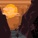
But of course, I couldn't just put up any random crap — that would insult my viewers. This is a very good establishment, as you know, full of very good art. So I couldn't help but be amazed by the simple–yet–effective composition of this piece, where the brightest part of it is right in the center for all to see, and its dazzling colours carrying the… oh, what's this? It's off–center? Might as well fix that while I'm here.
Right, the colours. They really say a lot in so little, which is one of the strong strengths of pixel art: having a limited palette to say what you want, and yet making the most out of those limitations. Pixel artists have developed so many techniques for shading that regular artists don't even think about — dithering, cross–hatching, blanket–coating, et cetera — that the whole application of colours is a discipline on their own. It's especially astonishing given how the majority of pixel artists are their own colourists, due to both tradition and the ease of changing one colour to another, unlike many artists who decide to post lineart and let somebody else colour.
So the washed–out colours and low contrast of the valley lends it a murky and cool feel, which contrasts nicely with the hot–hot sun up above. It really makes you feel like you're caught in the last remaining bastion of cool as the sun sets on you, lowering into the horizon as you sweat out your troubles within the interiors of the valley. But you know, the contrast is a bit too low… you can hardly appreciate the sharp edges of the rocks…
I did mention it was otherworldly, which is due mostly to this environment being incredibly unfamiliar to me. I have a small fetish for Winter, like all Canadians, just because of how prevalent it is — indeed, our seasons are fucked up, to say the least. Anything above twenty degrees is considered a hot day, which means the scorching sun is just as unfamiliar — especially so intimate. Not to mention how all our mountains are snow–capped instead of barren; anything less is more of a hill.
I suppose this contributes to the artist's original goal of telling a visual story, such as the hooded figure and the cat adding in an air of mystery to an otherwise beautiful, yet mundane scene. It's actually this cat that got the work published onto e926, otherwise it wouldn't have been furry enough. It's a shame that it's not as noticeable as it should be, I might as well alter the shading… and then the hooded figure is taking up my colours, so I should make them part of the rock…
You know, this mountain is really too hot for my tastes. And that path is such a sickly green as well, not fitting in with the colour scheme. I was always fascinated with a small sliver of water trickling down a dry–dry mountain, that contrast of life and death interacting, a microcosm of how the rivers were formed in the first place — water and earthquakes grinding away at the elements until something gave way — making my heart flutter. Wouldn't it be great to see the state of that before it goes over the edge, a little pool slowly filling up, the moment before the disaster, before it eventually tips over? That would be great!
So it was very wise of the artist to add in a thing like that, because that thin stream of water brings the whole piece together more so that any other. And I have every right to call them wise, because that artist was me, and me am I.
Alright, I admit it. What I fully expected to be an EZPZ update turned into a fetish for improving something really good and making it even better. The composition and colours are tighter and the added detail of turning a path into a river brings back memories of Pokemon Mystery Dungeon, and those were good memories. I don't want to be the asshole who disguises a brag as a bad thing, though it really is inconvenient sometimes to walk into something expecting one thing, and come out with another.
Pixel art is one of the least appreciated art forms out there, only mentioned as footnote of obscure mediums that people are intensely aware of due to its prevalence in video games, and yet nobody understands the sheer amount of effort it takes to make excellent pixel art. And it's a damn, damn shame, because it can create aesthetics like no other medium can. It says a lot in a little, and is extraordinarily easy to alter so that you can say even more.
Part of the reason I made the 10kB Gallery? To make work that says a lot in such a small space.
Date: 2017–02–08. Size: 1,826 bytes. Colours: 12.
Upscaled Dimensions: 1024×1024. Original Dimensions: 128×128.